
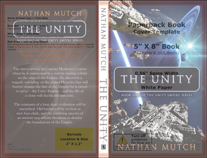
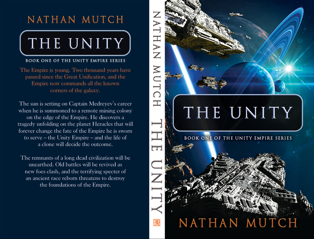
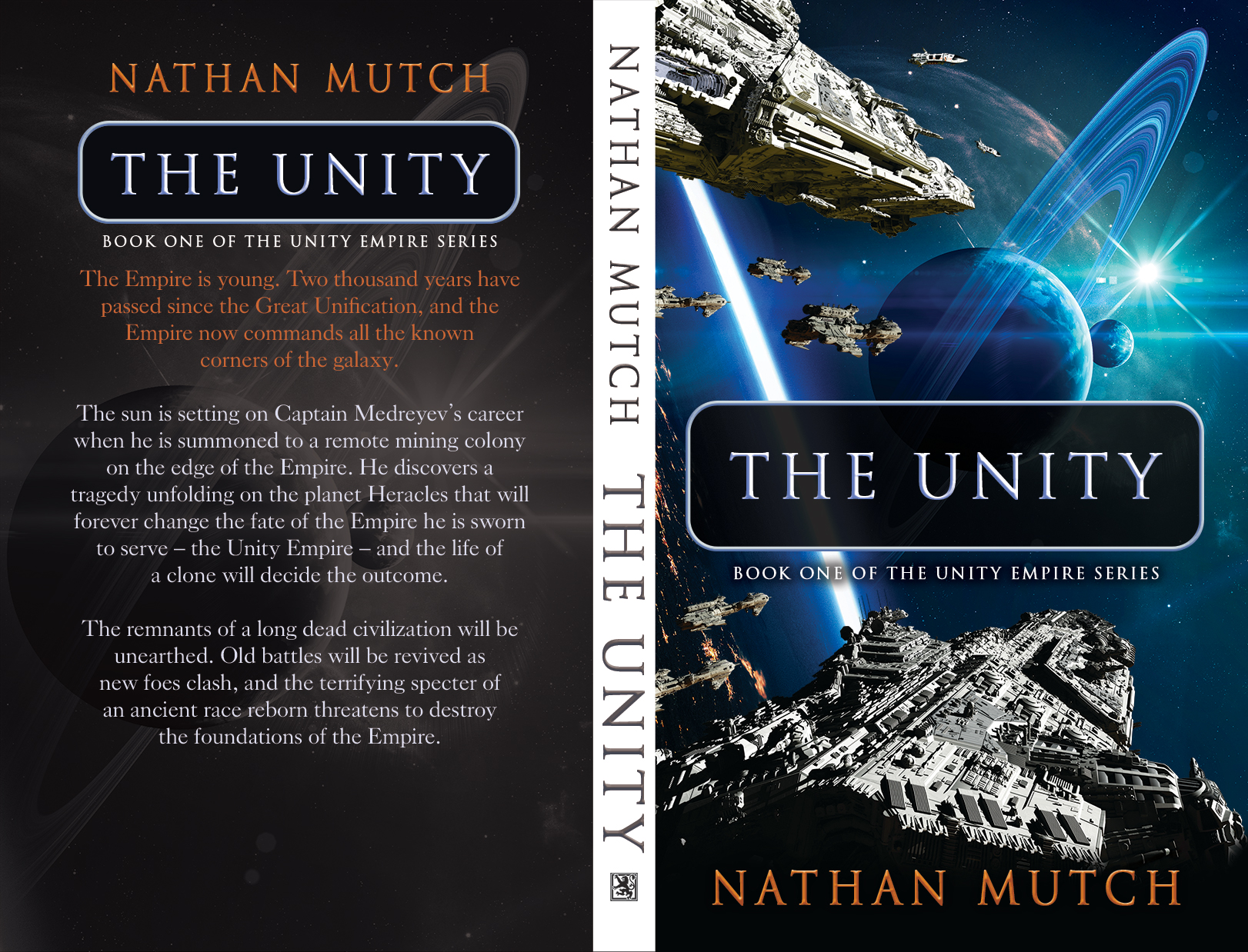
Let me begin by saying that creating a cover for a science fiction novel has been one of the more difficult things I’ve ever attempted. Here’s a first look at the full finished cover for my latest novel, A Song For The Dead. A Song For the Dead Cover Now, I’d like to take you on a little tour to show you how I got where I am today. The first cover of The Unity Fast forward to 2016 and you’ll find me contemplating a re-write of The Unity in preparation for the release of the next chapter in the series. I couldn’t release the second edition with its original cover. It just didn’t feel right. I got to work brushing up on my Photoshop skills, and within a few days, I’d put together something I thought I was happy with. Everything looked good to me on the screen, but I’d made the rookie mistake of using the same file for the Print version as I had for the eBook version. When I got the proof in the mail, I couldn’t figure out why it looked muted. It lacked punch, but I didn’t have the right vocabulary to describe why the cover was lacking. Compared to the original cover, this one was a huge step up, but it was still far from what I wanted to convey. Second cover for The Unity Realizing that I was lacking the necessary know-how to design a good cover, I took to the internet. I spent hour after hour scouring the web for cover art that I liked. I took a course through Lynda on cover design, and I spent long hours glued to Adobe Illustrator and Photoshop. What I ended up with was a finer appreciation for what cover designers do (and all designers, bless their hearts). If I had gone with a professional cover designer way back in 2012 when I first began, I would have ended up with a cover that I was happy with (probably), but I also wouldn’t have taken this voyage of discovery. Step one: Step two: The second edition of The Unity came with a new book blurb. The back cover is equally important, but this is something I didn’t understand until I had taken a good long look at the first edition. Let’s compare: First edition book blurb: Second edition book blurb: I saw that the first blurb gave an incomplete picture. The first line was vague, and the “remote mining colony” was just a place. I gave a history of the Empire with three little ideas that added mystery and allowed the reader to begin creating their own visualization of this new universe. “How can the Empire be young if 2000 years have passed since its creation?” asks the reader. The answer must be that there are already thousands of years worth of known prehistory to the Great Unification. As well, if the Empire now commands all the known corners of the galaxy, then there must have been 2000 years of conflict and conquest. Step three: The third cover was starting to take shape. Finding the best layout I wanted the fleet of Unity ships to give the reader a sense of the overwhelming reach and magnitude of the Empire itself. They are focused, heading toward the same point in space. Guides are important Stay in the lines. This cover is for print, so it’s made in CMYK, 300 DPI. Nearly there The form and structure is nearly there. I just needed to tweak a few things. Everything needed to be centered in the trim margins (careful to stay in the live area). The back cover was all right, but I thought it needed a bit of a punch as well with the cover background resized and adjusted for opacity and luminosity. I also needed a better imprint logo. The old imprint logo was a single dot over the letter U (hearkening back to the black planet from the original cover) inside a three diamond frame. original imprint logo The new imprint is a lion superimposed on double square frame. New imprint logo Finally, I had arrived at something that I could be happy with, something with a theme I could duplicate in subsequent cover art for the continuations in the series. Final version of The Unity cover While you can’t judge a book by its cover, the old adage remains: you never get a second chance to make a first impression. Hopefully, these new covers make up for the originals.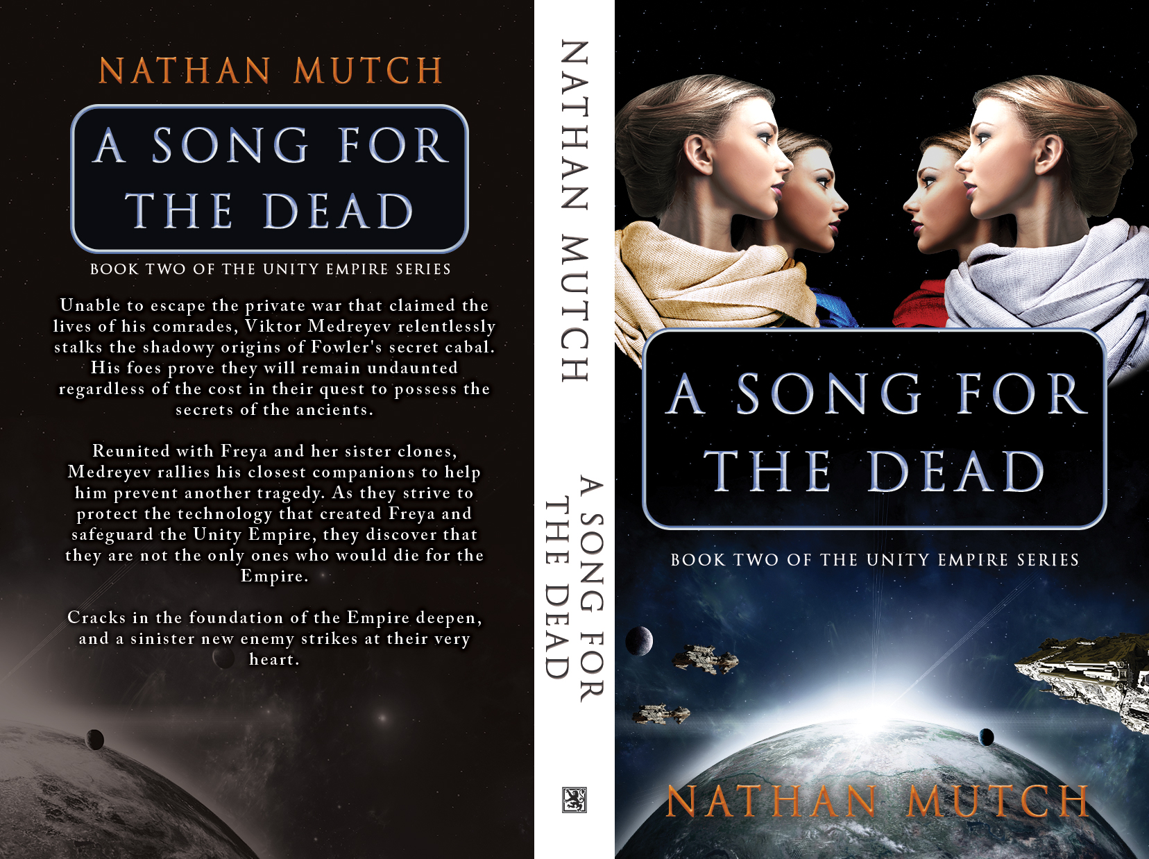
I started out in 2012 with only a vague notion of how I wanted my cover to look. I imagined a simple/retro looking cover that would appeal to true sci-fi fans. What I ended up with was not so spectacular. I don’t have any regrets with this cover, though I can say that I’m glad to leave it behind.

Planning.
I built the eBook cover first in RGB. I gathered a smattering of space images and planet images to see which ones would best suit my intended message. Much like a good book blurb, a cover has to tell a story. I wanted there to be action and direction. The previous cover had none of that.
Tell a story.
The image has to tell a story. I remember as a young reader I would often pause mid-sentence to glance back at the cover. As I progressed through a story, the cover art would take on new significance in my mind, and I often marveled at how the faces of the characters depicted on the cover became more familiar. My imagination took over and I could paint entire scenes described in the text based on the single image on the cover. I had forgotten that sense of awe and wonder over the years. It’s clear to me now in hindsight that I hadn’t been thinking of my reader when I designed both the first and second cover.
“The remnants of a long dead empire will be unearthed.
Viktor Medreyev’s military career was almost over when he is summoned to a remote mining colony. He discovers a tragedy unfolding on the planet Heracles that will forever change the fate of the Empire he is sworn to serve -The Unity Empire- and the life of a clone will decide the outcome.
Old battles will be revived as new foes clash, and the terrifying specter of an ancient race reborn threatens to unravel the fabric of civilization.”
“The Empire is young. Two thousand years have passed since the Great Unification, and the Empire now commands all the known corners of the galaxy.
The sun is setting on Captain Medreyev’s career when he is summoned to a remote mining colony on the edge of the Empire. He discovers a tragedy unfolding on the planet Heracles that will forever change the fate of the Empire he is sworn to serve –the Unity Empire– and the life of a clone will decide the outcome.
The remnants of a long dead civilization will be unearthed. Old battles will be revived as new foes clash, and the terrifying specter of an ancient race reborn threatens to destroy the foundations of the Empire.”
The changes were enough to tell a complete story.
Put it all together.


1
Comments 1
Hey Nathan
That’s just awesome.
Thanks for letting me in.
We can never quit going ahead.
You really inspired me.
Thank you again.
Gordon @ Praxair